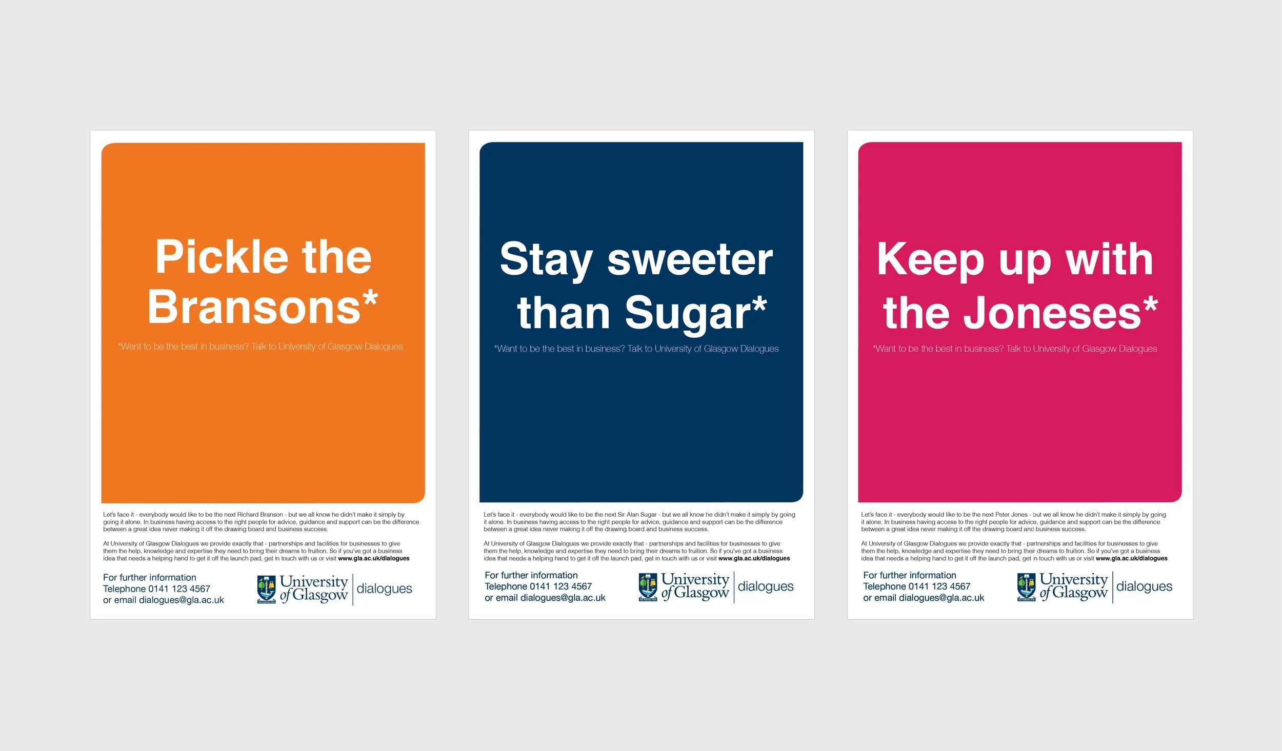
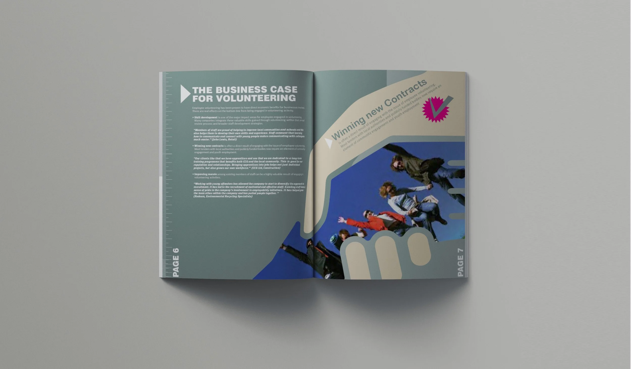
Who says B2B has to be boring?

A lot of B2B comms tend to look a bit flat. There’s a notion that you can’t be clever or too interesting.

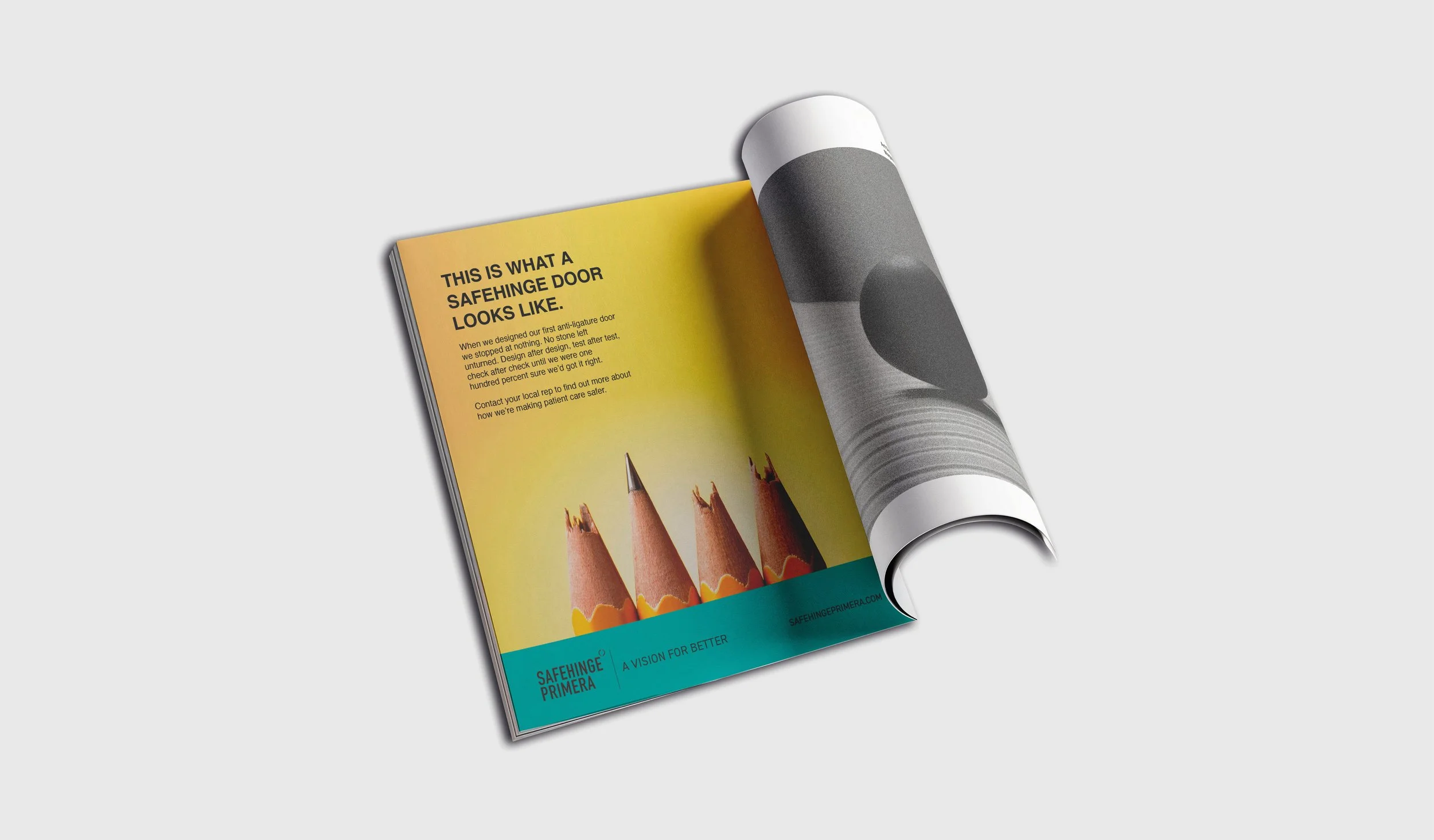
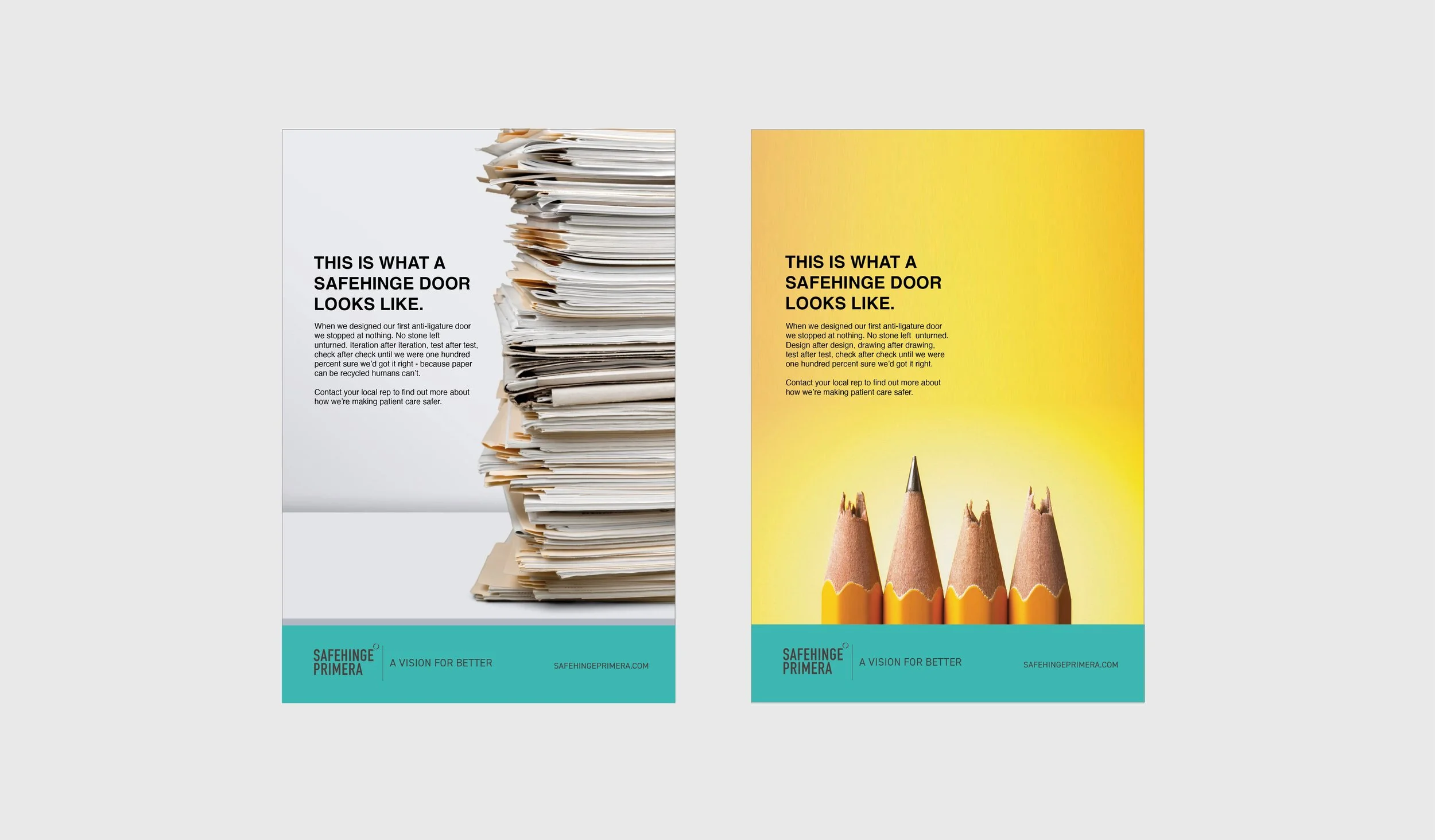
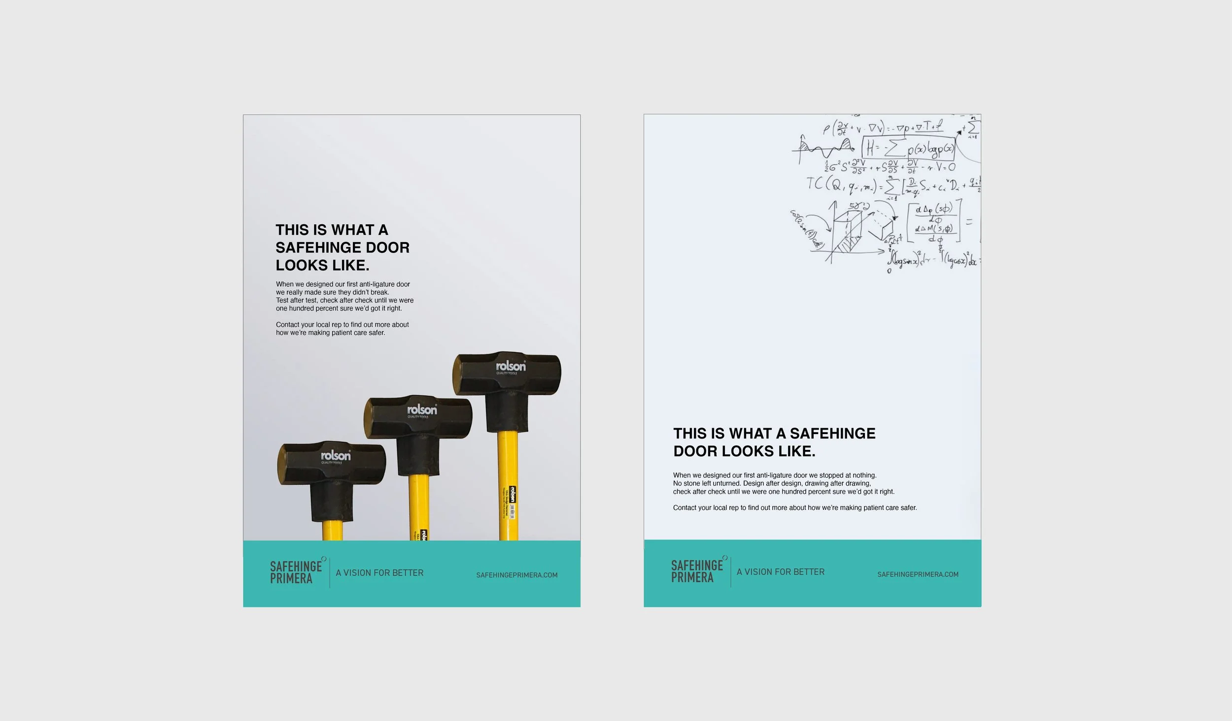
Safehinge Primera make anti-ligature and safety doors for hospitals and care facilities. The product is all about design expertise and rigorous testing to produce a product that is the safest on the market.

I developed a series of visual metaphors to show this aspect, in a visual style that would have true stand out in the market place and grab attention.

SSPO Annual Report.

The Scottish Salmon Producers Organisation is a public sector body, that represents the Scottish salmon farming industry. They produce a wide range of documents and reports each year aimed at promoting the industry to politicians, regulators, and government officials. With this kind of audience the report had to be designed to look clean, authorotative and the salient points made to stand out.

University of Glasgow Dialogues Advertising Campaign

The objective? To get businesses to partner with the University as a resource centre for advice and research through their Dialogues initiative. The benefit to businesses? Succeed in business with the support of a world class University.

I wrote headlines using a play on words focussed around prominent successful business leaders (Richard Branson, Alan Sugar & Peter Jones) to give an aspirational feel.

Design was lead by the University brand guidelines but this is a good example of when you’ve got a strong set of headlines, sometimes it’s best to keep the design simple and let the words do the heavy lifting.

The campaign ran in business publications and press.

SBC Employee Handbook

Scottish Business in the Community are a network of companies that champion a responsible business agenda across a range of sectors in Scotland. One of their initiatives is encouraging employers and employees to undertake volunteer work - it’s widely shown to have a number of benefits for the individual and the business. This publication was designed to promote this - it showcases the benefits using a bold, positive graphic approach to keep it aligned with the messaging.

RBS Corporate Publishing

RBS wanted to produce an employee magazine every quarter. This 96pp A5 publication contained information about the business but also more lifestyle content, so employees would actually find the magazine useful. As such design cues were taken from consumer facing magazines to keep the feel open, accessible and relatable.

Previous
Previous

Countdown to Giving Identity

Next
Next

CCLASP Copywriting